Part 1 Section 10 of the Milan Art Institute Mastery Program
The first assignment is about taking a complicated composition, like a crowd of people, and simplifying the forms. I’ll be honest. Never in my life have I ever thought to myself, “let’s draw a crowd of people!” Honestly, until this year I didn’t even draw portraits. So, naturally, I’ve been dreading this assignment. I knew it was coming, and I wasn’t looking forward to it.
But, as it turns out, it really wasn’t that bad. Like all the other lessons I’ve done in the Mastery Program it’s broken down into manageable steps. I’m happy with the result. As always, there’s room for improvement. But to go from “I don’t want to do this lesson” to “Hey, look what I did!” is pretty cool.
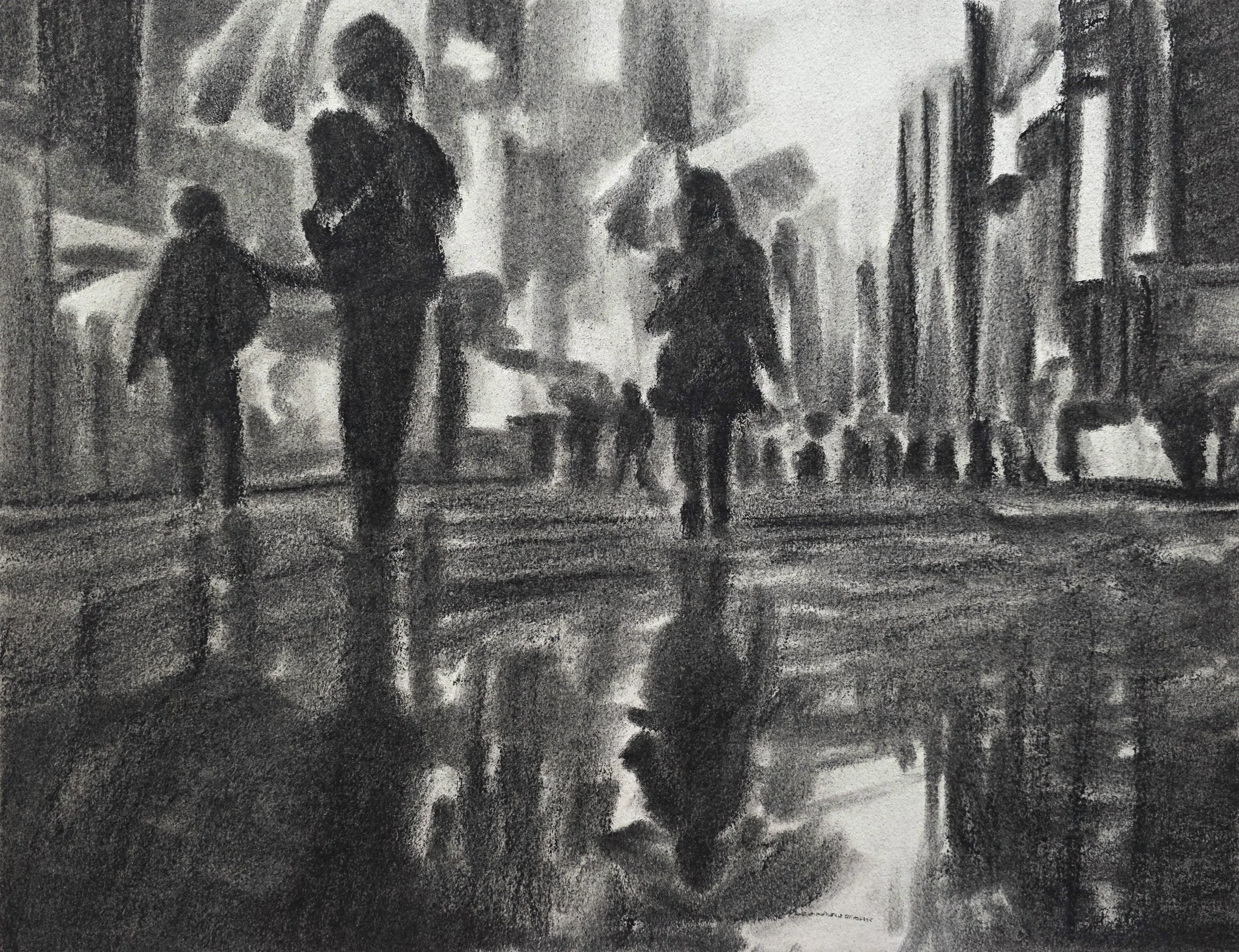
A crowd of people, in the rain, on a city street. Drawn in charcoal.
I ruined my second assignment.
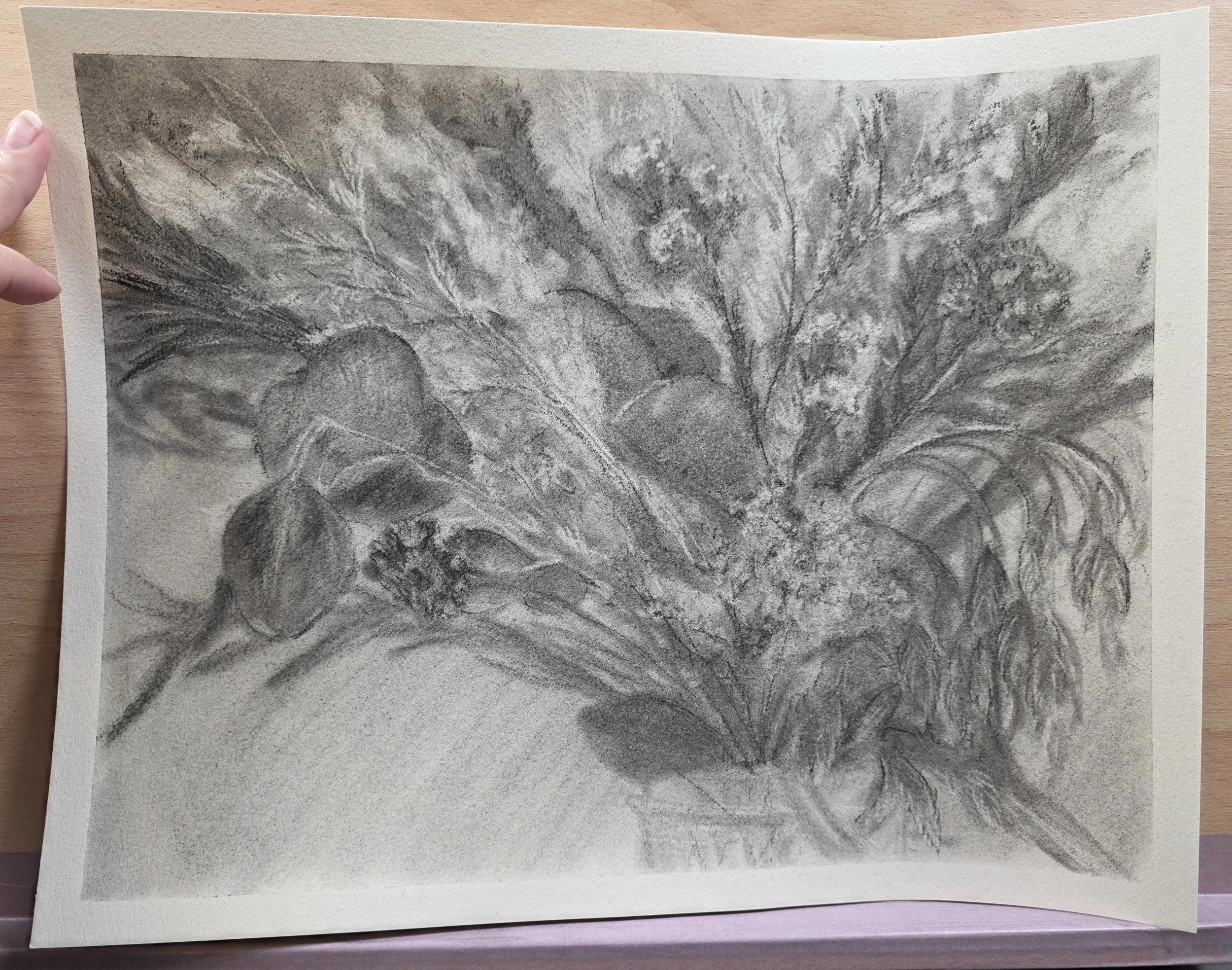
A bouquet of dried flowers, drawn in charcoal, ruined by fixative…
The assignment was to get a bouquet of flowers and draw them in charcoal. I don’t typically keep fresh flowers, or plants in general, anywhere my cats could reach them. So instead, I purchased a bouquet of dried flowers from Amazon.
I love drawing flowers, so I thought this assignment would be a piece of cake. And for the most part it was. It was very enjoyable. I completed the assignment and was pleased with my drawing.
Now charcoal is messy, and it falls of the paper, and smears if you look at it. So I took my SpectraFix, a spray fixative you can use indoors, and just started spraying. Well, the nozzle was partially clogged so instead of a nice fine mist, I got a stream that obliterated my details. It saturated the paper so much, that even after letting it completely dry while still taped down, the paper warped. It is what it is.
Ok, now let’s talk about the oil painting. Once again, we took a complex composition with lots of detail and simplified the design. I chose a landscape with a moody feel. I liked the muted color story and the dark sky. A keen eyed observer will note that my colors are not muted. And that was part of the feedback I received from the coaches. My colors were too saturated.
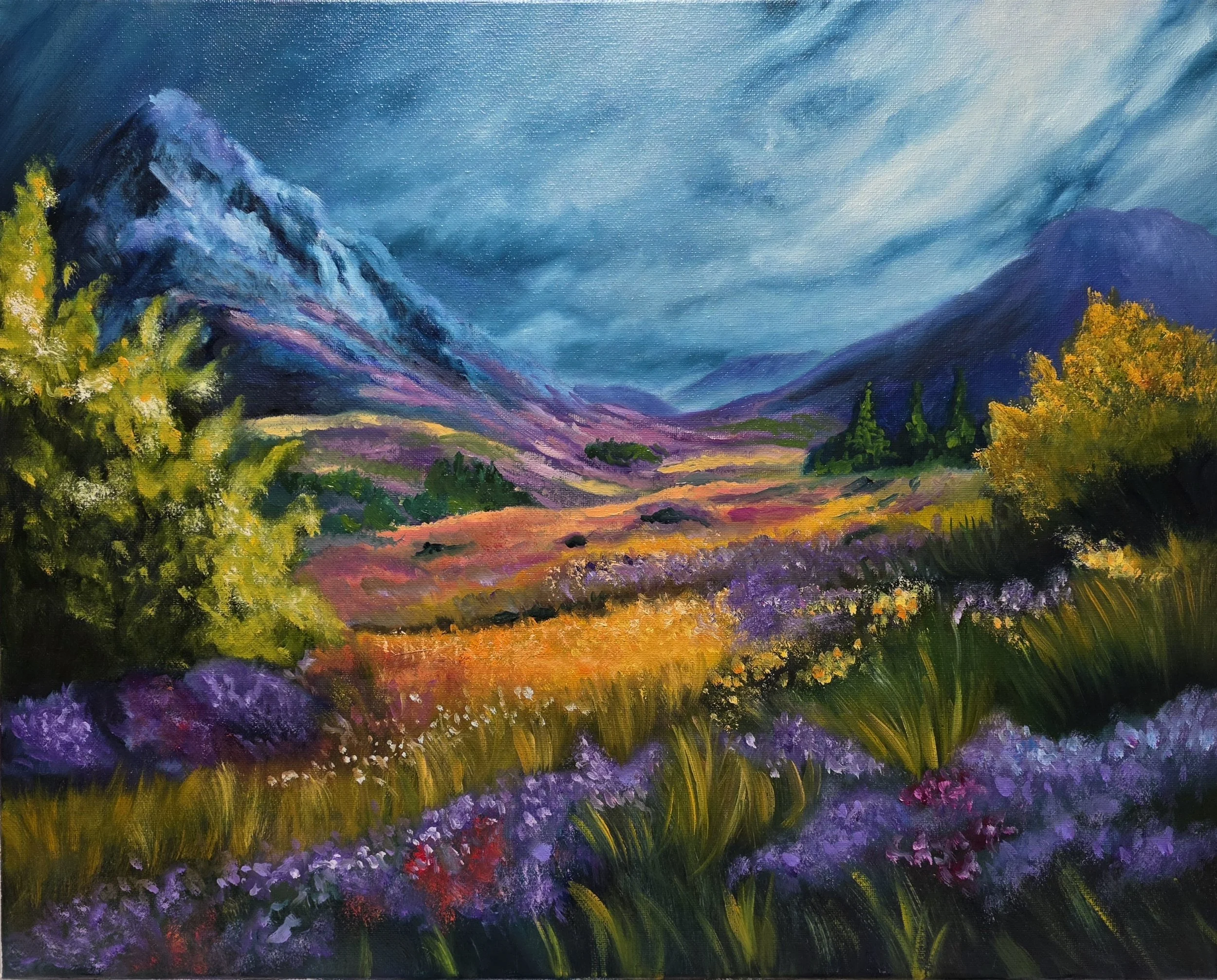
A colorful field in front of mountains, under a moody sky. Oil painting on 16” x 20” canvas.
To start this painting we used a method called “indirect painting”. What is that, you might ask? Well, you take bright, and I mean bright colors, mix it with a fast drying opaque white paint and just block in the whole composition. The first stage is kind of weird and feels really wrong. It’s not pretty.
After your first layer has dried to the touch, you then completely cover your entire canvas with a dark transparent color. You then remove sections of the dark paint to pull out your highlights. You can also pull back some of the paint to block in your mid-tones.
Then finally, you go in with your opaque colors to add the details. For me, this was the most enjoyable step. It’s where my painting started to look like something recognizable.
The more I look at this finished painting in my studio, the more I like it. I’m finding that’s the way it goes with these assignments. I have to live with the finished result for a while before I can admit to myself that I did a good job.
Is that weird? Or is that just an artist thing?